Step 1 : Define your tags
Do not add classes to these elements.
In this section, you want to directly edit HTML tags, so that it will affect all elements on the site without having to use a class.
BODY - DEFAULT
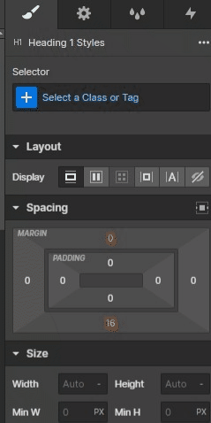
Start by editing your body
Add your font, change text color and text size
Paragraph - DEFAULT
Lorem ipsum dolor sit amet, consectetur adipiscing elit. Suspendisse varius enim in eros elementum tristique. Duis cursus, mi quis viverra ornare, eros dolor interdum nulla, ut commodo diam libero vitae erat.
Block Quote - 16 PX (DEFAULT)
Lorem ipsum dolor sit amet
Text Link - DEFAULT
Lorem ipsumHeading 1
Paris Blockchain Week
Heading 2
Paris Blockchain Week
Heading 3 - 28px (Default)
Paris Blockchain Week
Heading 4 - 20px (Default)
Paris Blockchain Week
Step 2: Define your color swatches
What is a color swatch ?
In this section, we want to save our colors to use them on our project later.
We will not use the class, but the color swatches defined.
Main colors
Primary
#ec38aa
Secondary
#c860db
Other colors
Brand
#XXXXXX
Pink
#XXXXXX
Orange
#XXXXXX
CYAN
#XXXXXX
YELLOW
#XXXXXX
Green
#XXXXXX
Custom Color 7
#XXXXXX
Custom Color 8
#XXXXXX
Custom Color 9
#XXXXXX
Custom Color 10
#XXXXXX
Step 3: Reusable classes
What are reusable classes ?
In this section, default classes and combo classes are explained.
Here are all the classes that you will be able to use throughout your project.
Classes
Combo
Suggested
Description
This class has to be applied on the section element.
Sections are used to structure your content vertically.
Properties
padding-top: 64px,
padding-bottom: 64px
The 100vh combo class makes your section fullheight according to the user's viewport dimensions.
Useful for heros or specific sections
Properties
padding-top: 64px,
padding-bottom: 64px,
+ height: 100vh
Changes the section background color to the primary color defined in your swatches.
Properties
padding-top: 64px,
padding-bottom: 64px,
+ background-color: ??
Changes the section background color to the secondary color defined in your swatches.
Properties
padding-top: 64px,
padding-bottom: 64px,
+ background-color: ??
Changes the section background color to a grey color defined in your swatches.
Properties
padding-top: 64px,
padding-bottom: 64px,
+ background-color: ??
This class has to be applied on the container element.
Containers are used to structure your content horizontally.
Properties
padding-left: 32px,
padding-right: 32px,
max-width: 1280px
This combo class adds flex display to your container, and centers its content horizontally.
Properties
padding-left: 32px,
padding-right: 32px,
max-width: 1280px,
+ display: flex,
+ flex-direction: vertical,
+ align-items: center,
+ text-align: center
This combo class adds flex display to your container, and centers its content vertically.
Can be combined with the centered combo-class.
Properties
padding-left: 32px,
padding-right: 32px,
max-width: 1280px,
+ display: flex,
+ flex-direction: vertical,
+ justify-content: center
This class grows your container to 100% of parent's height.
Useful for 100vh sections.
Properties
padding-left: 32px,
padding-right: 32px,
max-width: 1280px,
+ height: 100%
These classes can be applied on grid elements.
Grid layouts are used to structure your content.
(Combo classes are available on all layouts.)
Properties
gap: 32px,
width: 100%
The gapless combo class removes the horizontal & vertical gap.
Properties
- gap: 32px,
width: 100%,
+ gap: 0px
The gap-small combo class reduces the gap to 16px.
Properties
- gap: 32px,
width: 100%,
+ gap: 16px
The gap-large combo class enlarges the gap to 64px.
Properties
- gap: 32px,
width: 100%,
+ gap: 64px
These classes can be applied on div elements.
These classes are used to modify your content layout.
Properties
display: flex,
flex-direction: vertical,
align-items: left,
justify-content: start
This combo class center your content.
Properties
display: flex,
flex-direction: vertical,
- align-items: left,
justify-content: start,
+ align-items: center,
+ text-align: center
This combo class center your content vertically
Properties
display: flex,
flex-direction: vertical,
align-items: left,
- justify-content: start,
+ justify-content: center
This combo class changes the flex direction of your div.
Properties
display: flex,
- flex-direction: vertical,
align-items: left,
justify-content: start,
+ flex-direction: horizontal
This combo class makes your div 100% of parent's height.
Properties
display: flex,
flex-direction: vertical,
align-items: left,
justify-content: start,
+ height: 100%
These classes can be applied on any element.
"mb" is for "margin-bottom", which is used to separate elements on your site.
Properties
margin-bottom: ??px
These classes can be applied on a grid or flex container.
"gap" is used to separate the elements inside your container.
Properties
gap: ??px
These classes can be applied on text elements.
These classes are used to modify your text weight.
Properties
font-weight: ??
If you need other weights like light, medium, semibold... you can add those.
Properties
font-weight: ??
These classes can be applied on text or wrapper elements.
These classes are used to modify your text color.
Properties
color: white
This class can be applied on any elements
This classe is used to hide an element on your website.
Properties
display: none
This class can be applied on any elements
This classe is used to hide an element on specific breakpoints